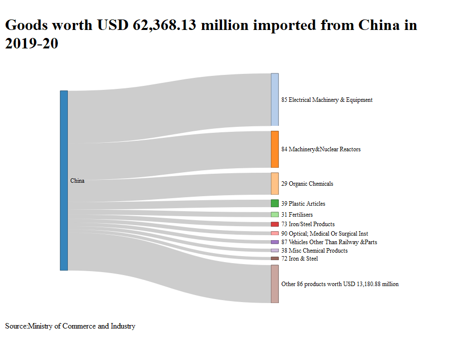


We have been working on data analysis and visualisation for the past quarter. One of our major learnings has been the realization that we have not adequately adjudged the value of a good chart. When someone who is working with the data creates a chart, they tend to compare the information communicated via the chart versus the information one can communicate through a table. A table communicates a lot more information. It can be sorted/arranged in multiple ways. For example, if we want to know the various products that India imports from China in a table, one can see the hundreds of products under 96 different chapters that India imports from China. We can also see the trends over multiple years as well as proportion of the total. If there is no limit on space, then one can also see which are the other countries that are providing the same products and how have their trends been over the past few years.
Compare that to any good-looking chart. A chart communicates a single piece of information or one trend or one picture. A chart would fail to communicate multiple trends for multiple products. Even if we assume, we use line charts beyond six lines, it will become very hard for someone to comprehend what is going on in the picture. While colours for different products could help but only to an extent. As we add information to a chart, it gets cluttered and people comprehend lesser and lesser. For any data scientist, this is a challenge that he/she faces on an ongoing basis. Would it not be important to depict what percentage of the total this one product mix? Would it not be important to show whether India has imported this product in the past or has the total domestic market size been increasing or decreasing? Finally, would it not be necessary to make sure that the chart conveys one idea clearly and catches the eye?
One of the things that could help someone make this decision would be to understand that the comparison between a table and a chart is fallacious ab initio. There is an underlying assumption that the person who is looking at the chart would also be looking at the table and comprehend whatever information the table has to offer. Whereas people do not like to read tables. In fact, people do not like to read and that is the primary reason we depict things visually so that it can catch peoples’ eye and they can understand more in less time. Therefore, the correct comparison is between someone who does not look at anything versus someone who looks at the chart. This automatically puts up the question, what is the one piece of information that I would like to communicate to the reader? For a data scientist, making graphs is easy, complicating them is easier and making them incomprehensible is automatic, and it takes effort to narrow it down to one idea and communicate it in an unambiguous manner.